
Mobile devices such as smartphones and tablets have conquered our world. These days it’s hard to find anyone who, when asked the time, will glance at their wrist instead of reaching for their smartphone. Why is the growing penetration of mobile devices relevant to restaurateurs? Because mobile offers another way to reach customers and is an important element in restaurant online marketing.
If your restaurant’s website is not compatible with mobile devices, you risk losing customers, especially those who make on-the-spot decisions about eating out. Even if you offer the most delicious food, a customer who can’t find the information they need on your restaurant’s website will quickly give up and go elsewhere.
Size is crucial
Think of how frustrating it is when you can’t tap the X to close that annoying ad on your smartphone’s screen? Or when you can’t read that interesting article without scrolling the text from side to side? Have you ever thought that your restaurant’s customers might be experiencing similar frustrations?
The main difference between mobile devices and computers is the screen size. While surfing the web on a laptop screen is comfortable and straightforward, doing the same thing on a small tablet or smartphone is much more difficult.
When viewing your website on a computer, you can see all its elements clearly – you don’t have to zoom in or change the resolution. Try doing it on mobile devices.
If your restaurant’s website is not mobile-ready, you will see for yourself how difficult it is to see and find anything there. The text is either too small to read or too large to fit on the screen. This means that it must be enlarged or scrolled horizontally. The tabs’ titles are too small, so you can’t easily tap them with your finger and go to sub-page you want.
Do you really think that potential customers will go through all of this to try your food? Adapting your website for mobile devices is a low-cost investment that can pay back very quickly and improve the effectiveness of your restaurant online marketing.
Easy to see location – let customers find you!
Every business website has several key elements. One of these is the contact details. That’s how the customers know where to find you and how to get there. You can imagine the annoyance, when, encouraged by an attractive menu, a potential client is unable to find where exactly this great restaurant is located.
Nowadays, a large proportion of your customers will be looking for your restaurant on their smartphones. So, make sure that the address information is easy to find and read – not only on computer monitors, but also on mobile devices.
Contact details such as the street address, but also your phone number and opening hours, should be placed in a visible position on your website: in the footer, or as one of the tabs. The principle is simple – the client should not be made to search for this information.
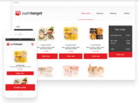
Online food ordering system and restaurant online marketing – how does a mobile website increase sales?
A mobile website is important for another reason. Customers use it to book a table and to order food remotely.
Nowadays, hardly anyone starts up their computer just to order food. It is much faster and more convenient to do it through a smartphone or a tablet. Additionally, your customers don’t always place orders or make reservations from home. What if they want to do it when they are out and about, and don’t have access to a computer?
Use the UpMenu restaurant website builder and let your customers easily order food online on their mobile devices. Each website built with upmenu.com is responsive by default.


